TERMOLI
2025
Took part in another competition: Rebranding Termoli, Italy.
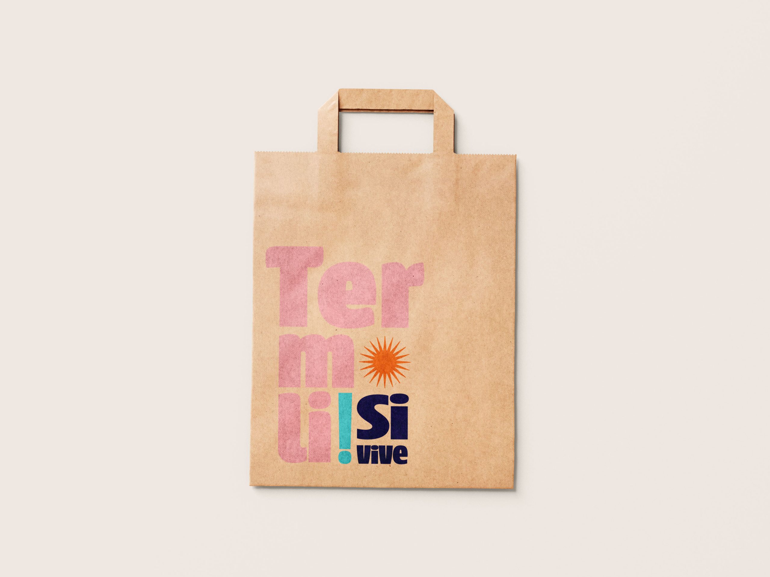
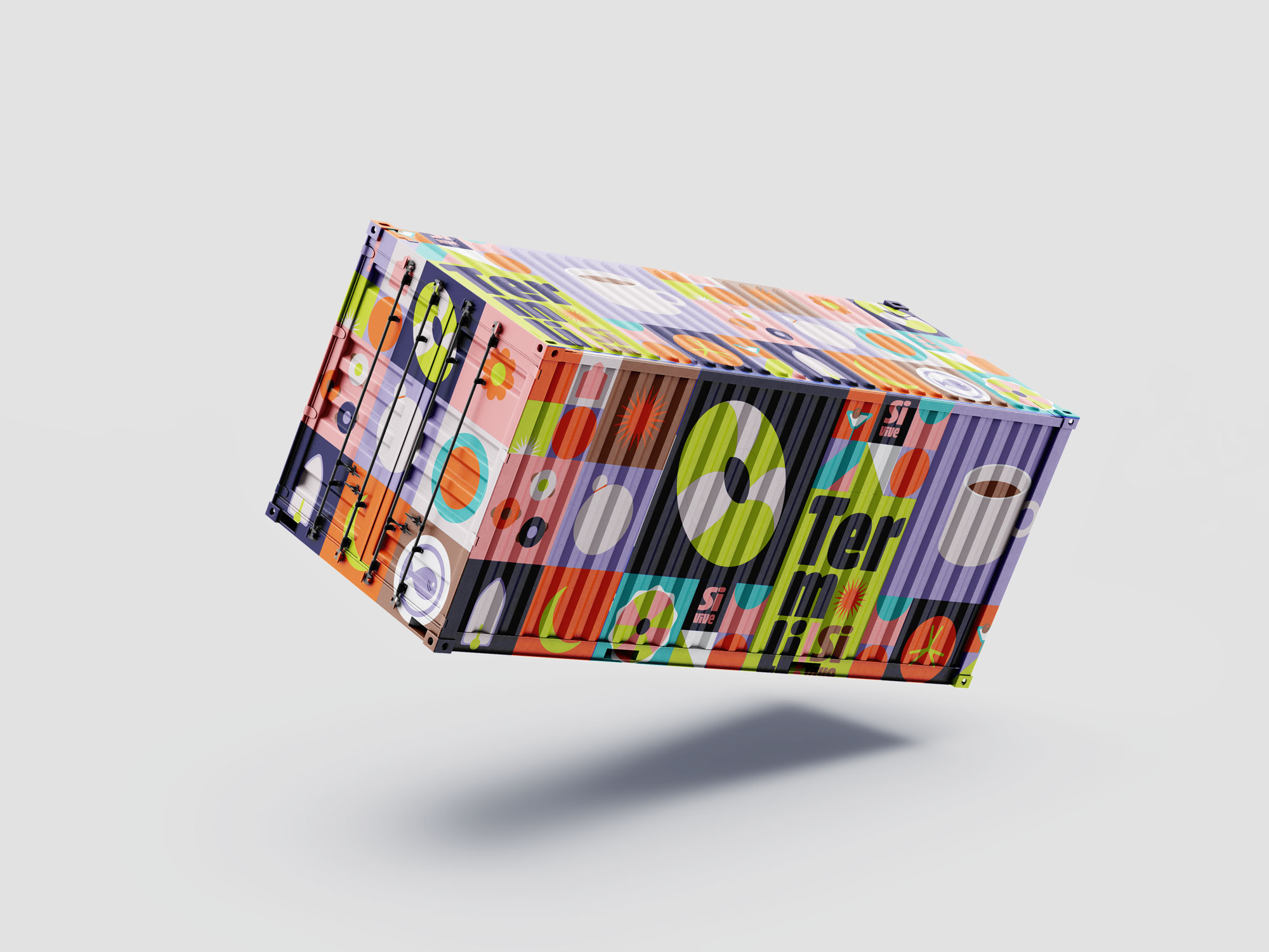
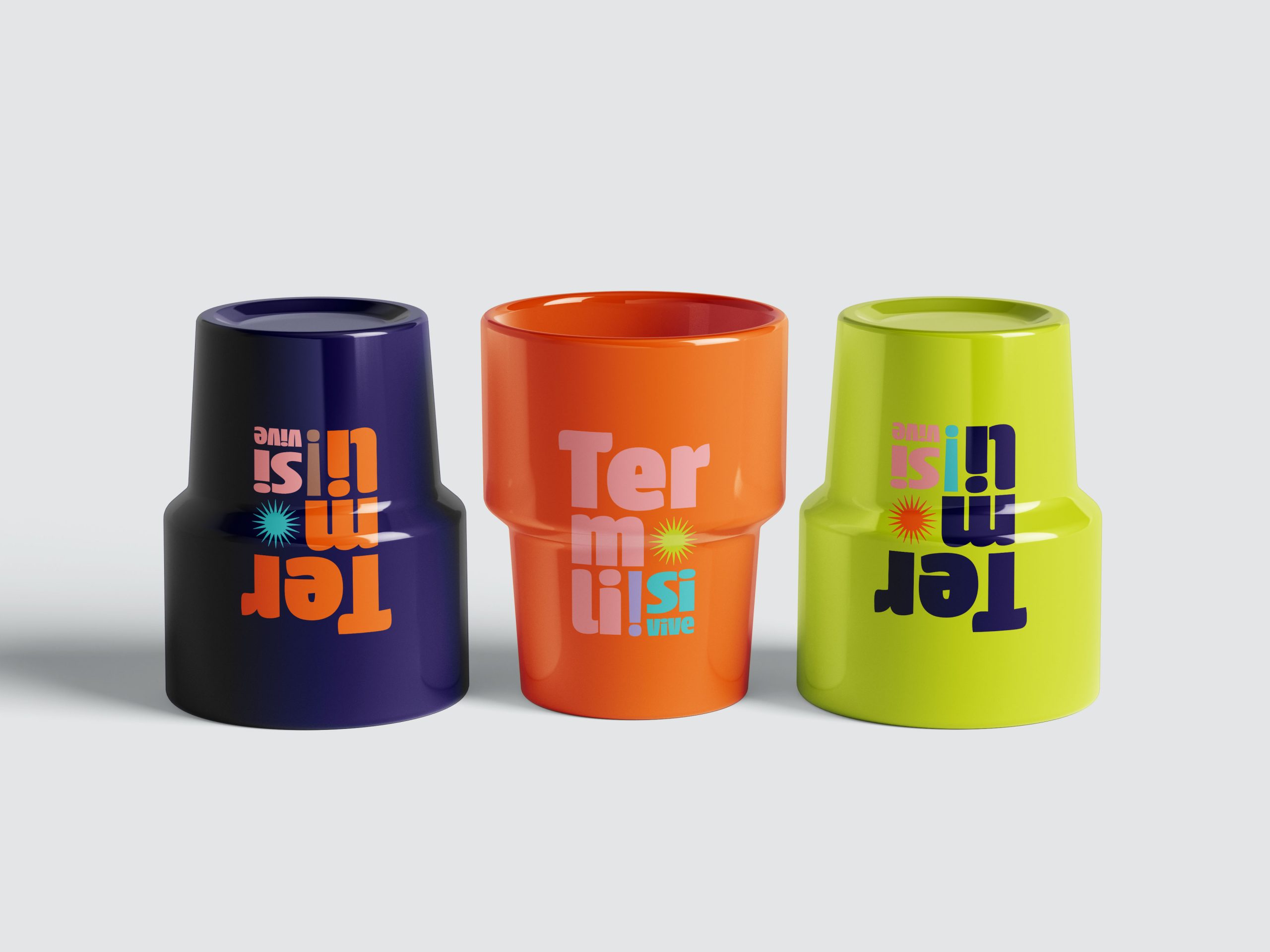
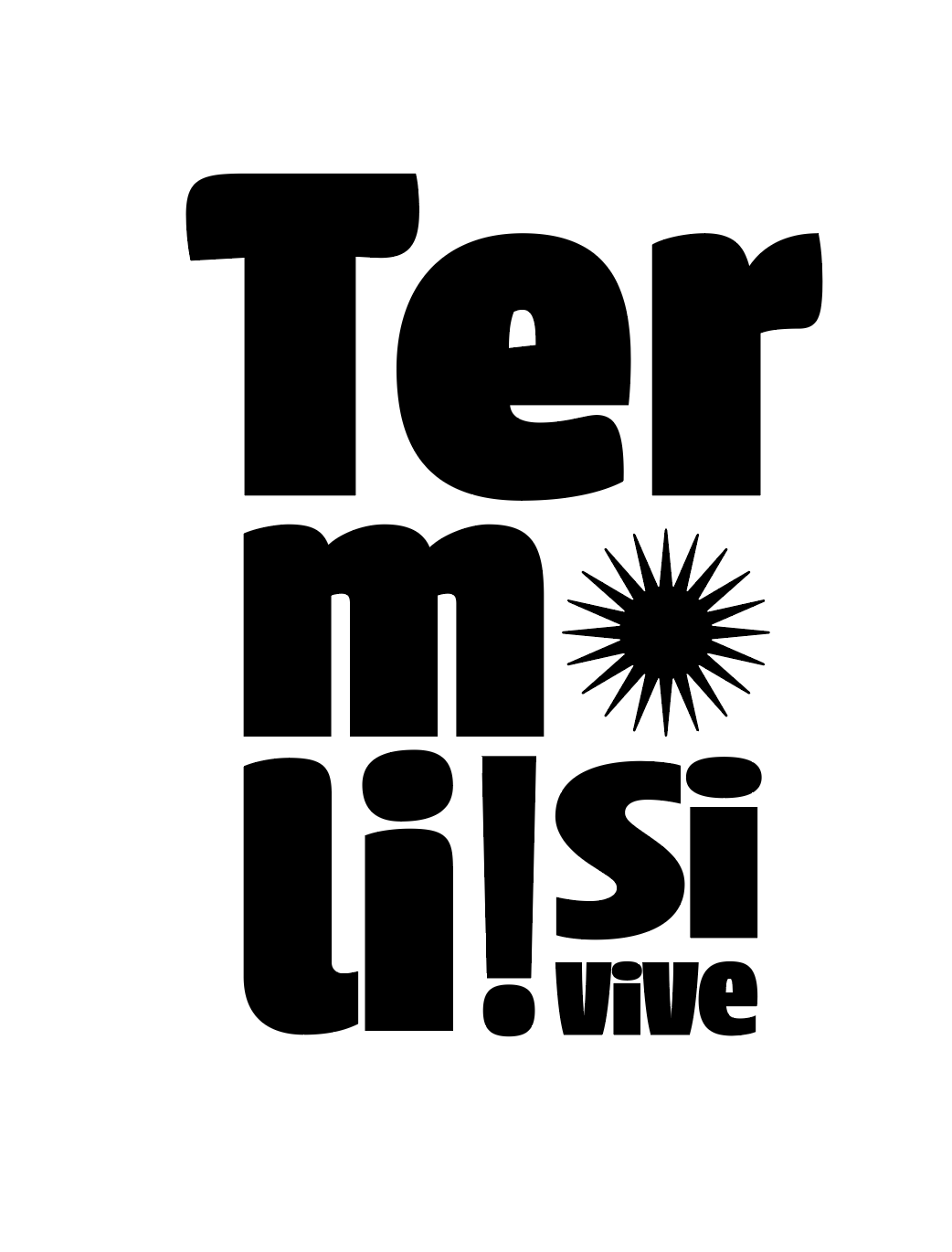
This logo captures the vibrant and dynamic spirit of Termoli. The bold, geometric typography conveys strength, confidence, and a modern identity while maintaining a sense of warmth and approachability. The stacked composition creates a sense of movement and energy, reflecting the lively atmosphere of the city.
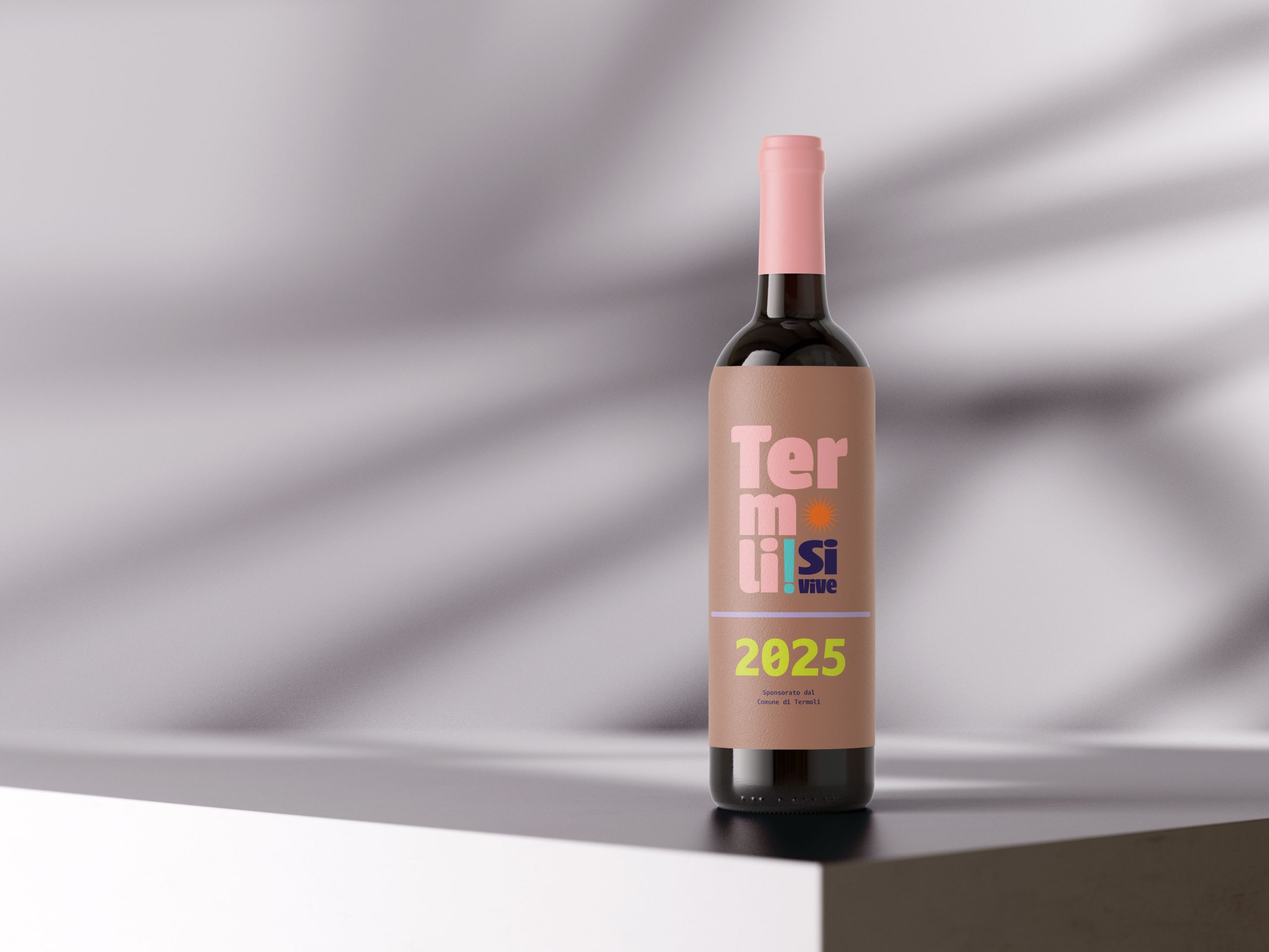
“Termoli! Si vive” is more than just a slogan—it’s a statement of identity and experience. It conveys that Termoli is not only a place to visit but a place to truly live and feel alive. The phrase evokes the city’s vibrant spirit, rich culture, and unique coastal charm, making it a compelling destination for residents and visitors alike. It’s an invitation to embrace Termoli’s energy, its warmth, and the authentic Mediterranean lifestyle.
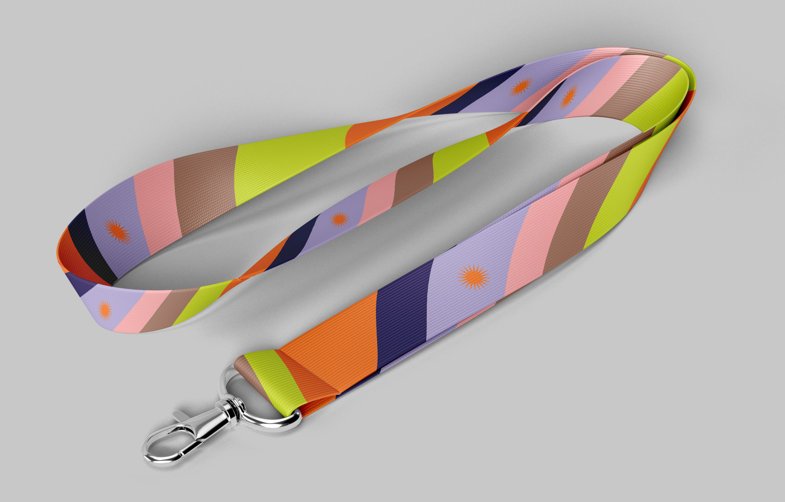
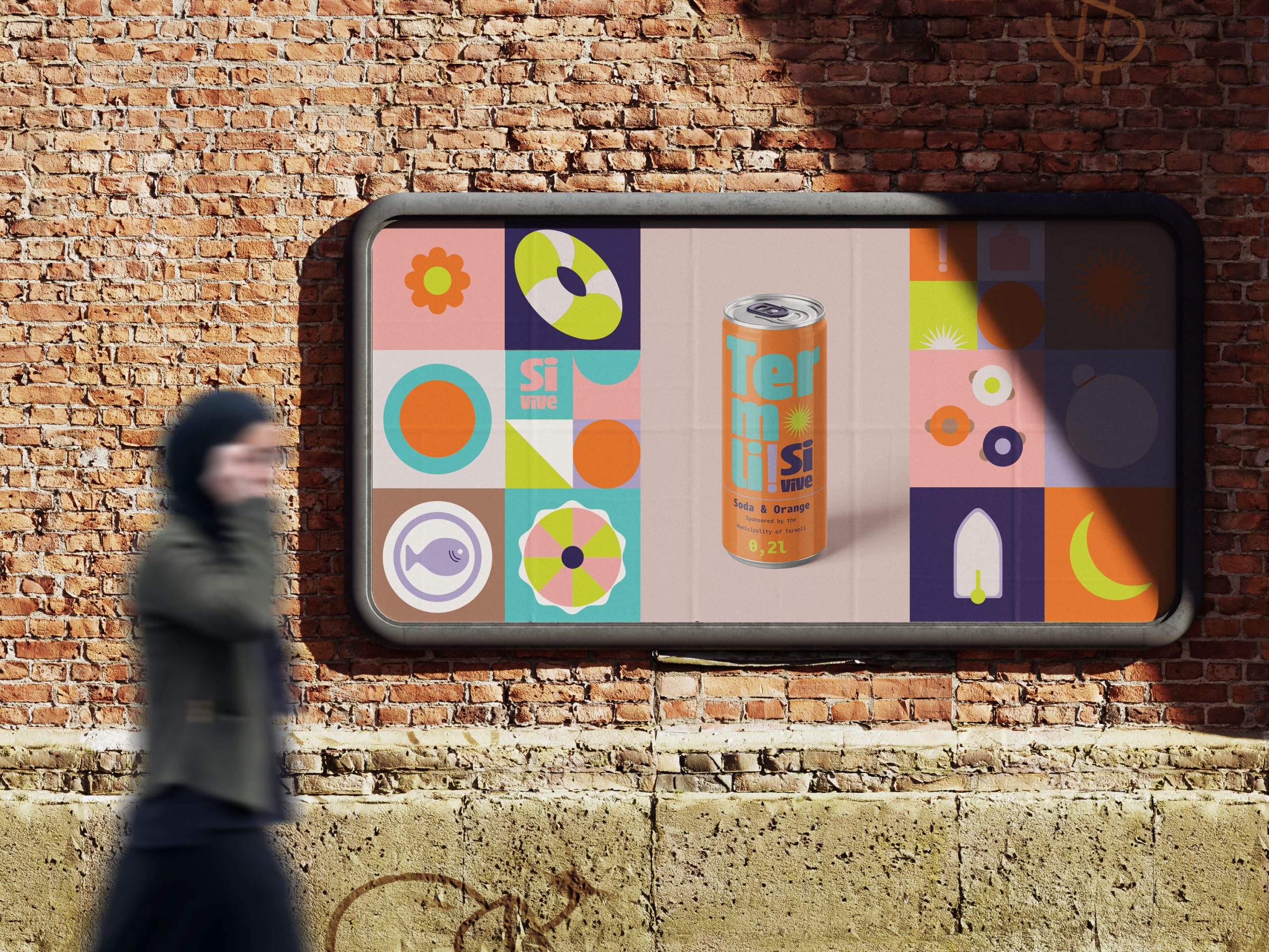
A key visual element is the stylized sun symbol, representing Termoli’s Mediterranean climate, seaside charm, and the warmth of its people. This element enhances the logo’s emotional appeal, making it more memorable and visually striking.
Overall, this design combines bold typography with symbolic elements to create a strong, contemporary identity for Termoli—one that reflects its lively character and invites both residents and visitors to fully experience everything it has to offer.
_